This 10 Things about Massimo Frascella series stems from an in-depth feature published by Autocar Magazine. Meant as an in-depth take on Audi’s Chief Creative Officer, it delved both into what brought him to Audi and where he plans to take the four rings during his tenure. Using that as a starting-off point, this series aims to highlight the key points while expanding them more in the Audi-specialist context this website aims to provide.
Part #1 began with Frascella’s taproot – the Audi TT (Mk1).
Part #2 focused on his background, broader than simply JLR and involving some TT Mk1 designer icons.
Part #3 took a closer look at his appreciation for the 2000s era Audi range that sold alongside the TT.
Part #4 examined where Audi goes from here.
Part #5 weighs screens versus switchgear.
Part #6 is decidedly not retro
Part #7 considers how he’ll expand upon Concept C.
The plan for this series is to cover two installments per day over five days. For this next installment, we examine his shifting of emphasis on touch screens to more focus on the tactile superiority of switchgear.
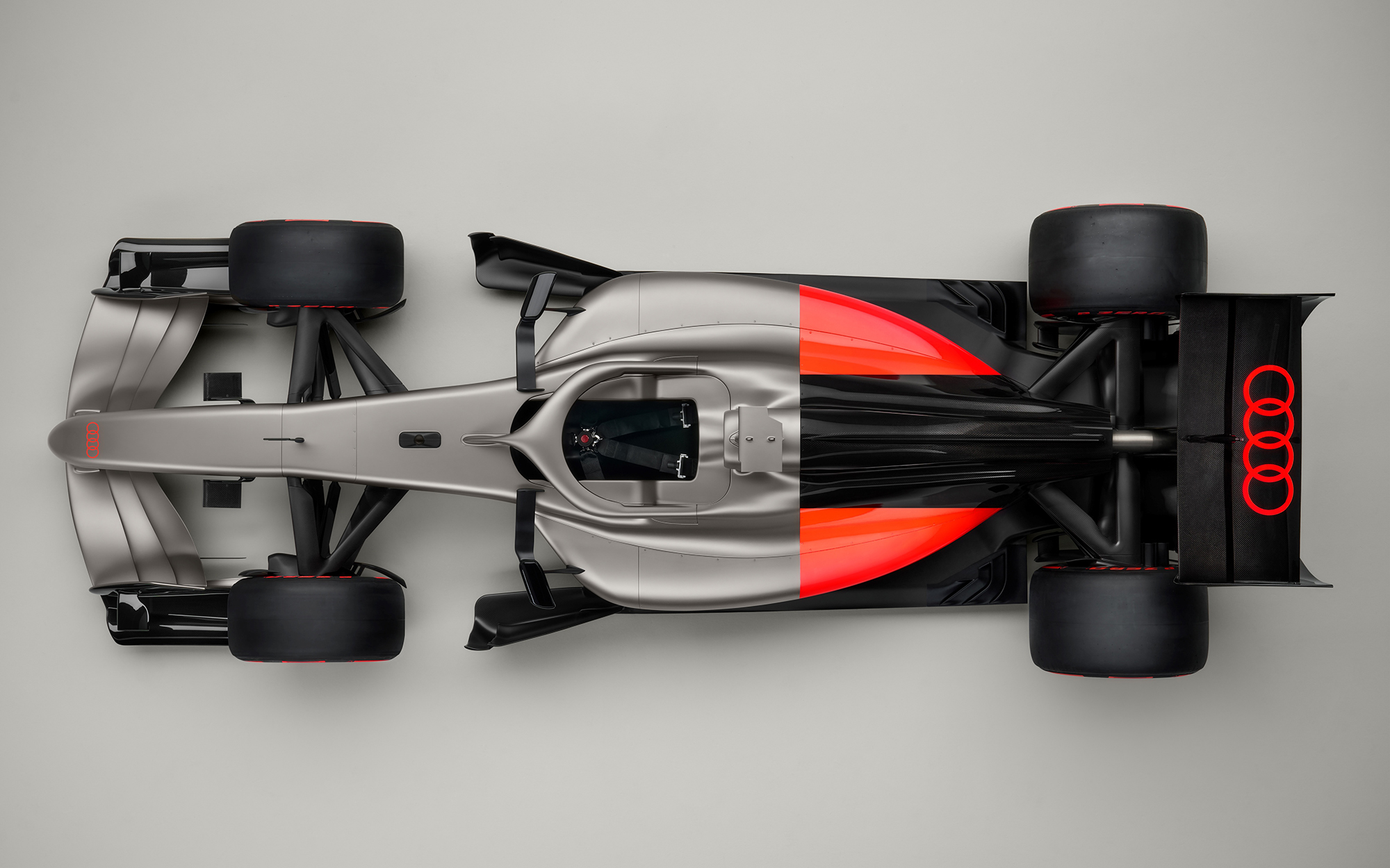
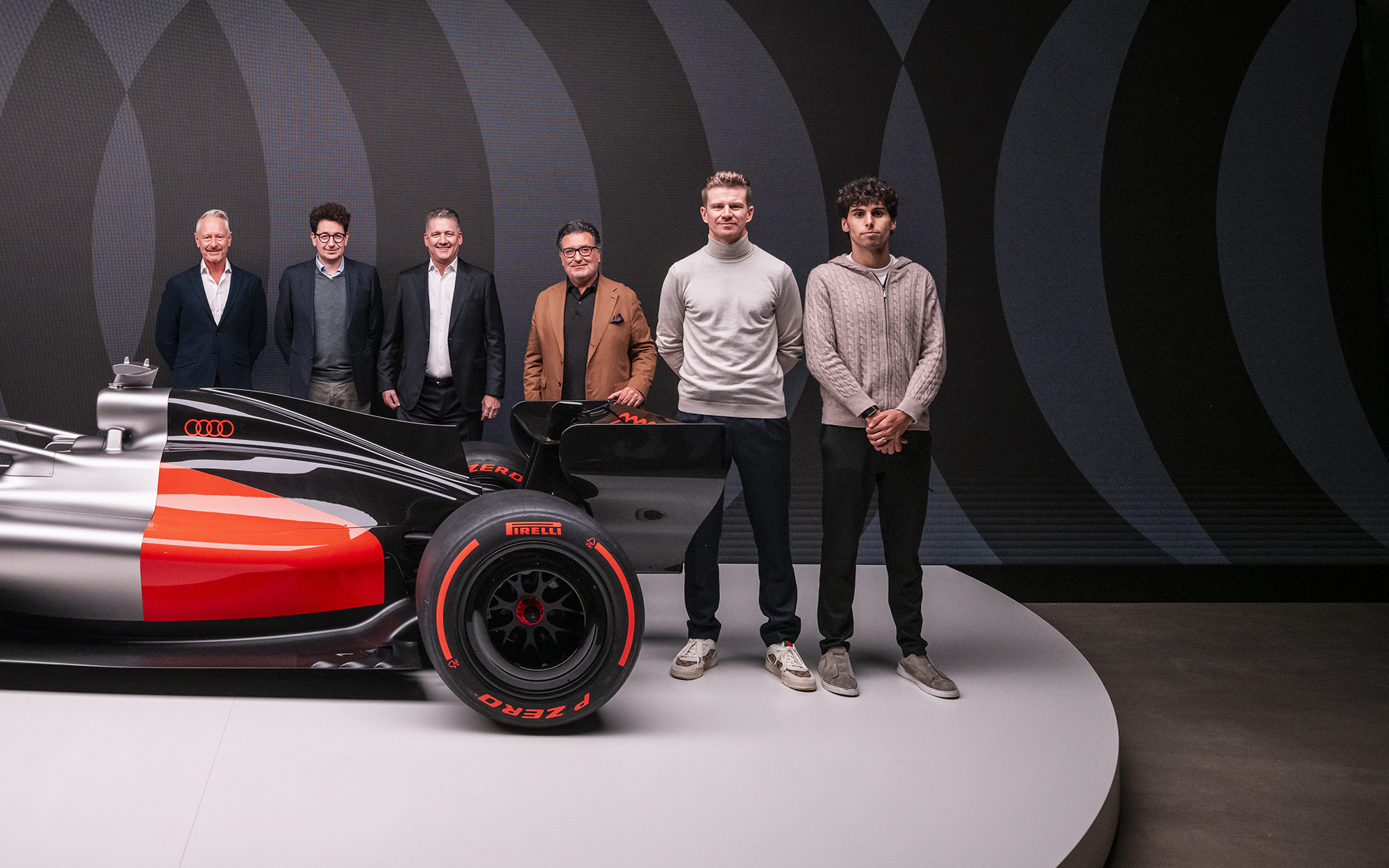
#8 ABOUT THAT F1 LIVERY
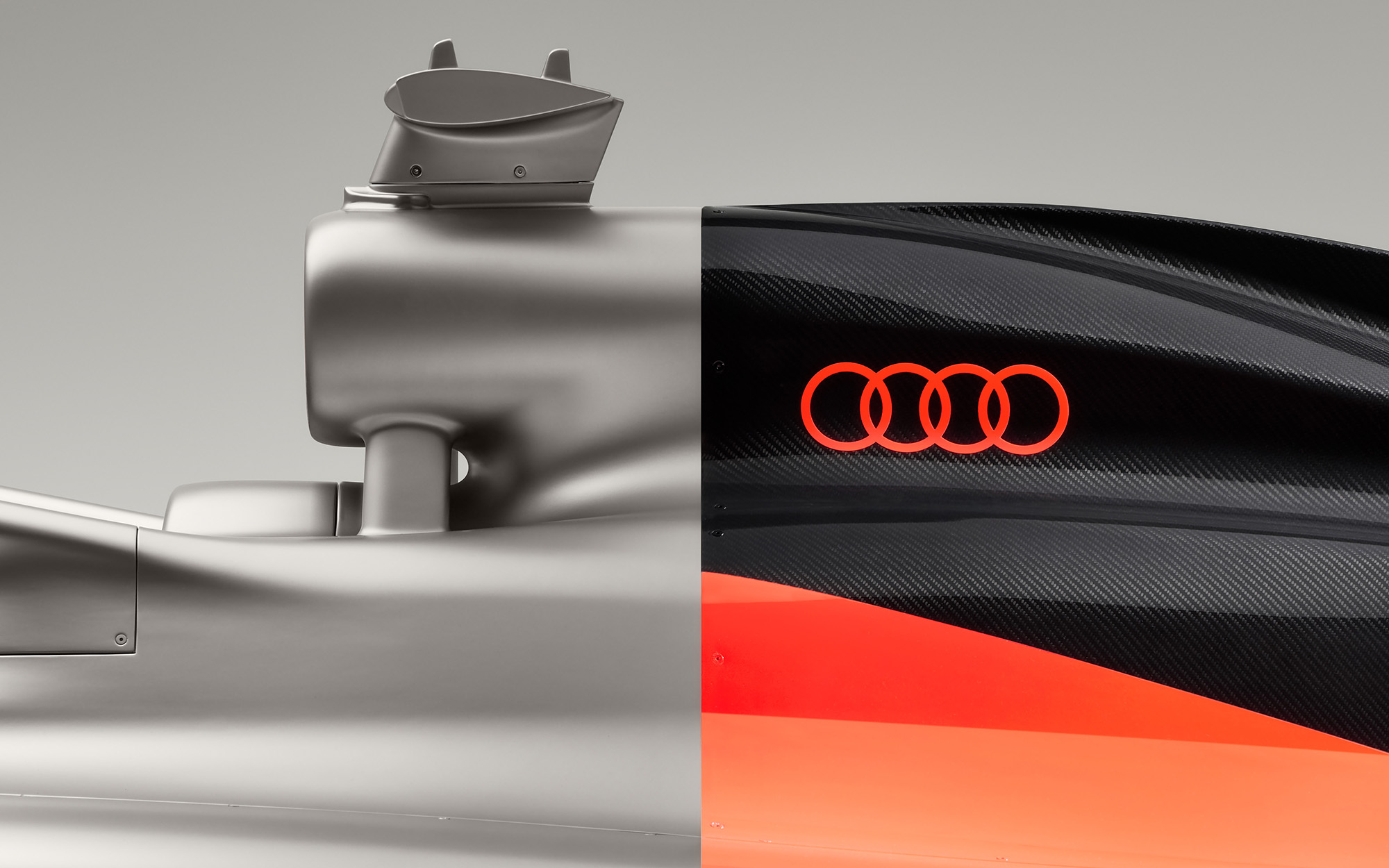
Frascella used the R26 as a platform to “soft launch”some of the characteristic he seeks to define his era of design at Audi. The first priority was to make the design “pop” in teh top-down pit lane shots. It’s “bold yet minimalist” that centers around another new signature color – “Lava Red”, a name we’ve seen repeatedly though one Frascella has confirmed to this website is also known as “Audi Red”.
Audi Red is an ever-evolving hue though, one that defines the brand at various times in its corporate identity lineage. This Audi Red a.k.a. Lava Red is, “a very vibrant expression of Audi red, particularly for Formula 1, which takes it to a new level in terms of emotional charge”.
To my eye, Lava Red seems to hark Audi’s Catalunya Red offered on the early TT (Mk3) RS 3 (8V) and first e-tron (type GE), while also subtly reminding us of the more orange-tinted reds of the early (ur) quattro era. That Massimo is also Italian makes me think that perhaps he learned a lesson from Ferrari where its street focused red hue of Rosso Corsa is more of a red red (think previous Audi Reds) whereas Rosso Scuderia developed for Ferrari F1 cars is more orange so as to really pop as red on television. Tied to Audi’s own entry into F1, the move seems both functional as well as an authentic way to tie-back to the original quattro era.
The other colors have been spoken about before. Titanium paint as a modern hat-tip to the Auto Union silver arrows (made of unpainted aluminum to save weight) is more modern, more exotic and an evolution that tidily also harks the grey tone of the traditional Audi Sport tri-colore rhombus and stripes of the early Audi Sport era spanning from quattro rally cars into the early V8 DTM cars.
That also brings us to the black segments of the car. “Initially there was a bit of conversation on how much exposed carbon fiber we need to have on the car for weight considerations – and as you can imagine from teh technical side, it was like: ‘The car is going to be black, right?’ Well, that not going to happen. It needs to be recognizable as an Audi. But we kept that black, which in a way , is in favor of the exposed carbon fiber, but also belongs as a primary color of Audi.”
Back to that early Audi Sport tri-colore rhombus, the dark segment began as a deep dark brown. By the DTM it had morphed to black, and as carbon or graphite in the F1 era it becomes even more modernized. That said, it also harks the earliest four ring competition Auto Unions because the unfinished aluminum intended for weight saving purposes that gave the “Silver Arrows” their name today gives way to unfinished carbon fiber for the very same reasons.